Have you ever spent more time checking out more items in a shop than you intended? Weren’t you just supposed to buy trousers, yet there you are, holding two pairs and a shirt? How did that happen?
Retailers have long been using their store layout to influence the buying process of their customers. They strategically design their stores in order to increase foot traffic and increase their sales, sometimes without the customers knowing it.
How does a store’s layout affect your buying habits?

Whatever store you enter, its layout serves two purposes – to attract and to sell.
Shopping is an experience. An effective store layout has the ability to maximise that experience by displaying the store’s items in a way that best highlights what is on offer. A fully optimised store layout makes customers come in to view the products and influence them into buying something.
Here are some of the areas of a store that retailers meticulously design and optimise in order to influence the buying process.
Windows
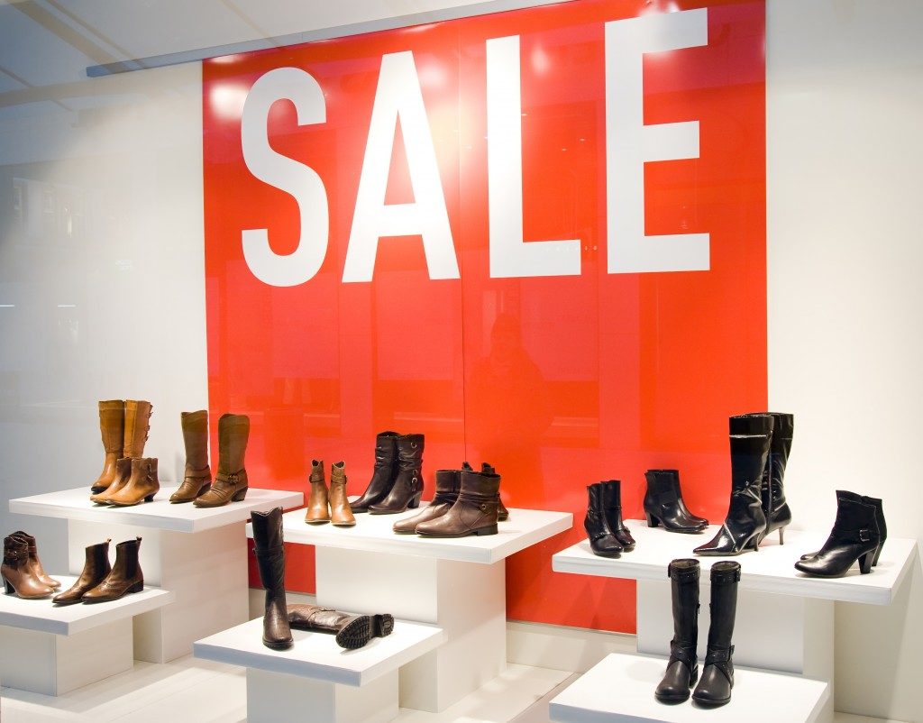
A lot of retailers often overlook the purpose of windows in a store. However, when used effectively, windows are great devices to capture attention.
Windows are like the eyes of the store. Just as the human eyes are considered the windows to one’s soul, store windows allow potential customers to understand what is on offer. Customers who are just looking around or are unsure of what to buy tend to look through the shop windows to check what’s for sale.
Many clothes shops place mannequins in their window displays dressed in products that follow a concept – athleisure, summer OOTDs, or back to school uniforms. The shop window allows potential customers to quickly gauge what a store offers and entices them to enter and look around.
The ‘decompression zone’
The decompression zone is located around the entrance of a store. As its name suggests, it is the area where you 'decompress' your senses as you transition from the outside world to the world created in the store.
The decompression zone is the area where retailers attract and introduce you to their brand. Imagine entering a store; the first thing you do is scan the place and assess the products for sale. Are they offering high-end, expensive products, cheap-and cheerful items, or somewhere inbetween? This is when you judge if you will continue looking around the store.
Floor plan

Even the way you navigate through a store is strategically planned. Many stores make the right side of their premises the ‘power wall’, or the area designed to have the biggest impact on customers, because most of us tend to go to the right when browsing in a shop.
Display shelves and other display units are placed in a way so the route through the store leads to curves or U-turns. People often find round and U-shapes interesting because they never know what they will find on the other side. Store layout designers optimise the shopping experience by ‘rewarding’ customers who go further into the store by creating mini experiences, such as displays of eye-catching products like gadgets or customised t-shirts.
Each store, no matter what it sells, is designed to influence you to buy. At the end of the day, however, the decision on what to buy relies on your ability to resist temptation.


